Web Design
Spotify Case Study: UI Soft Redesign
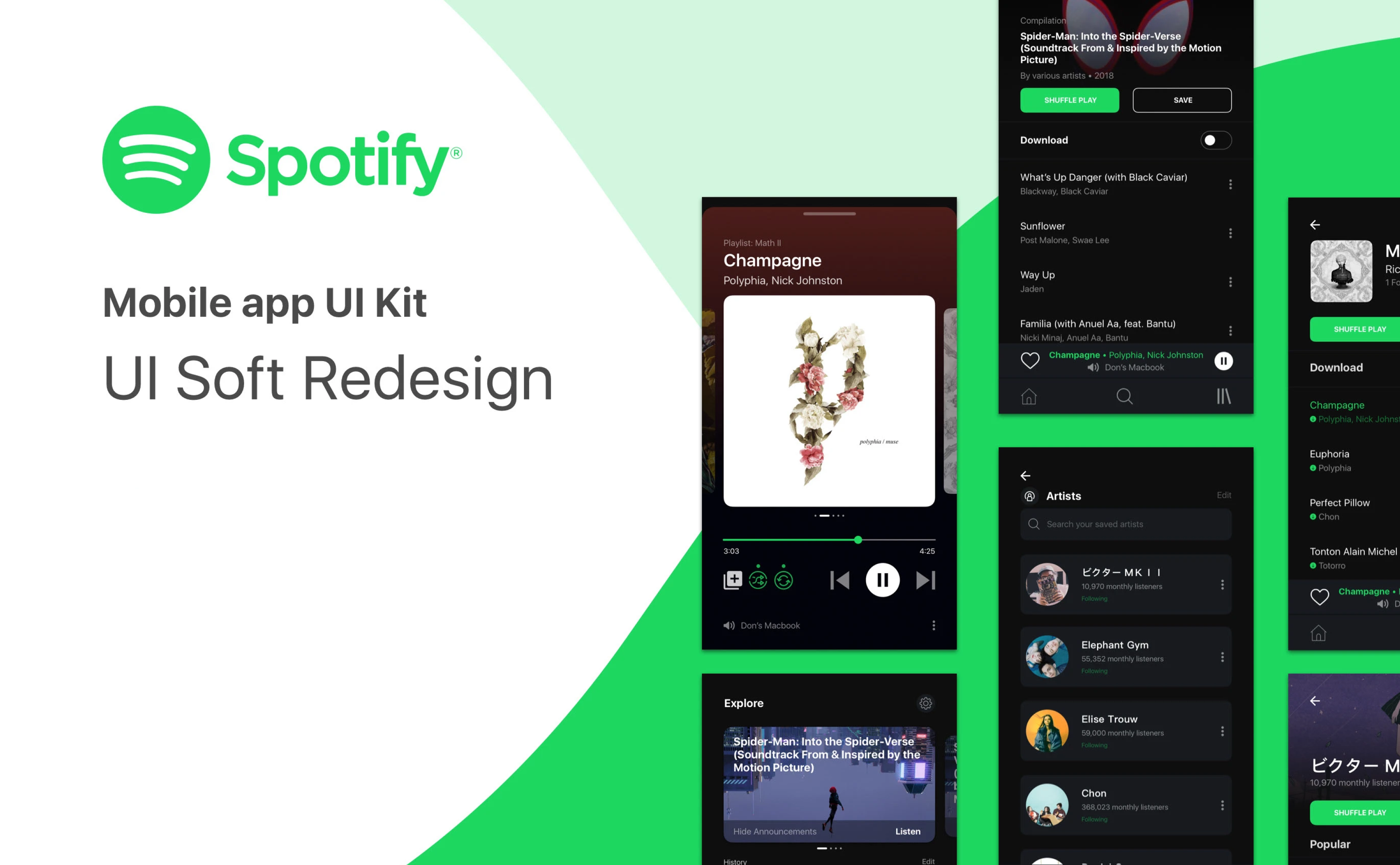
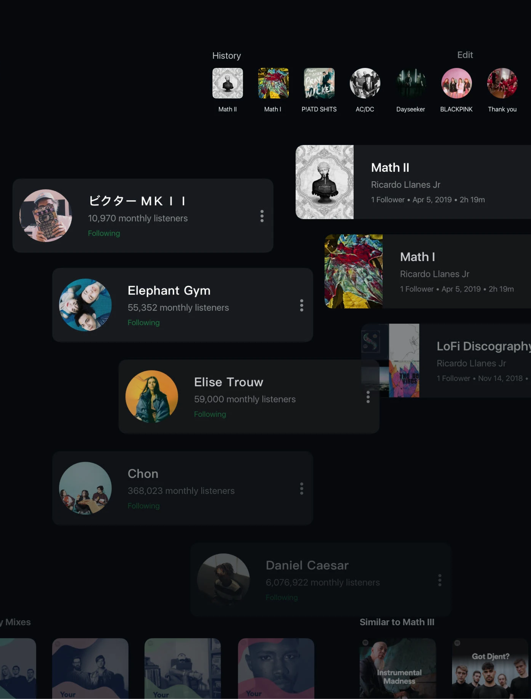
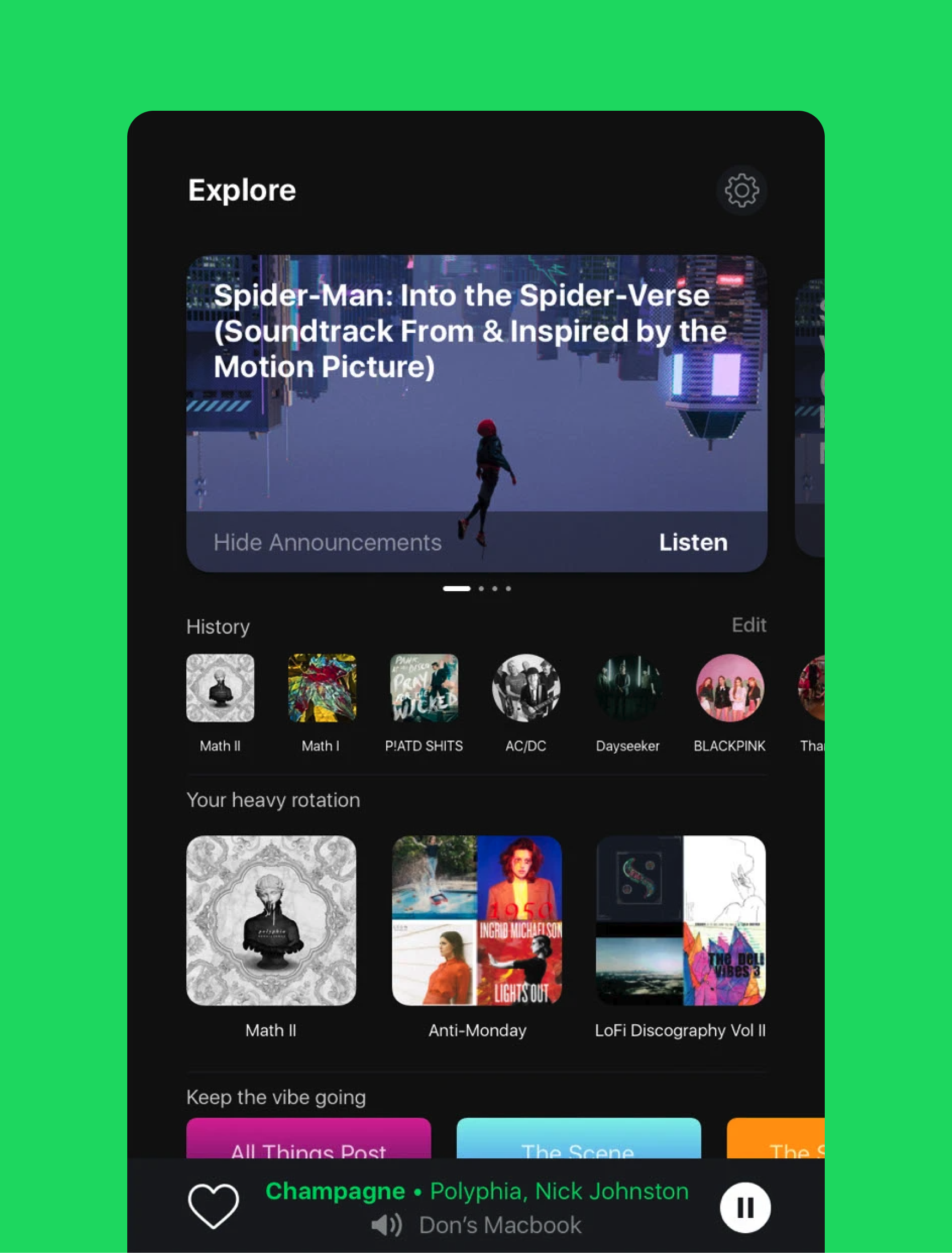
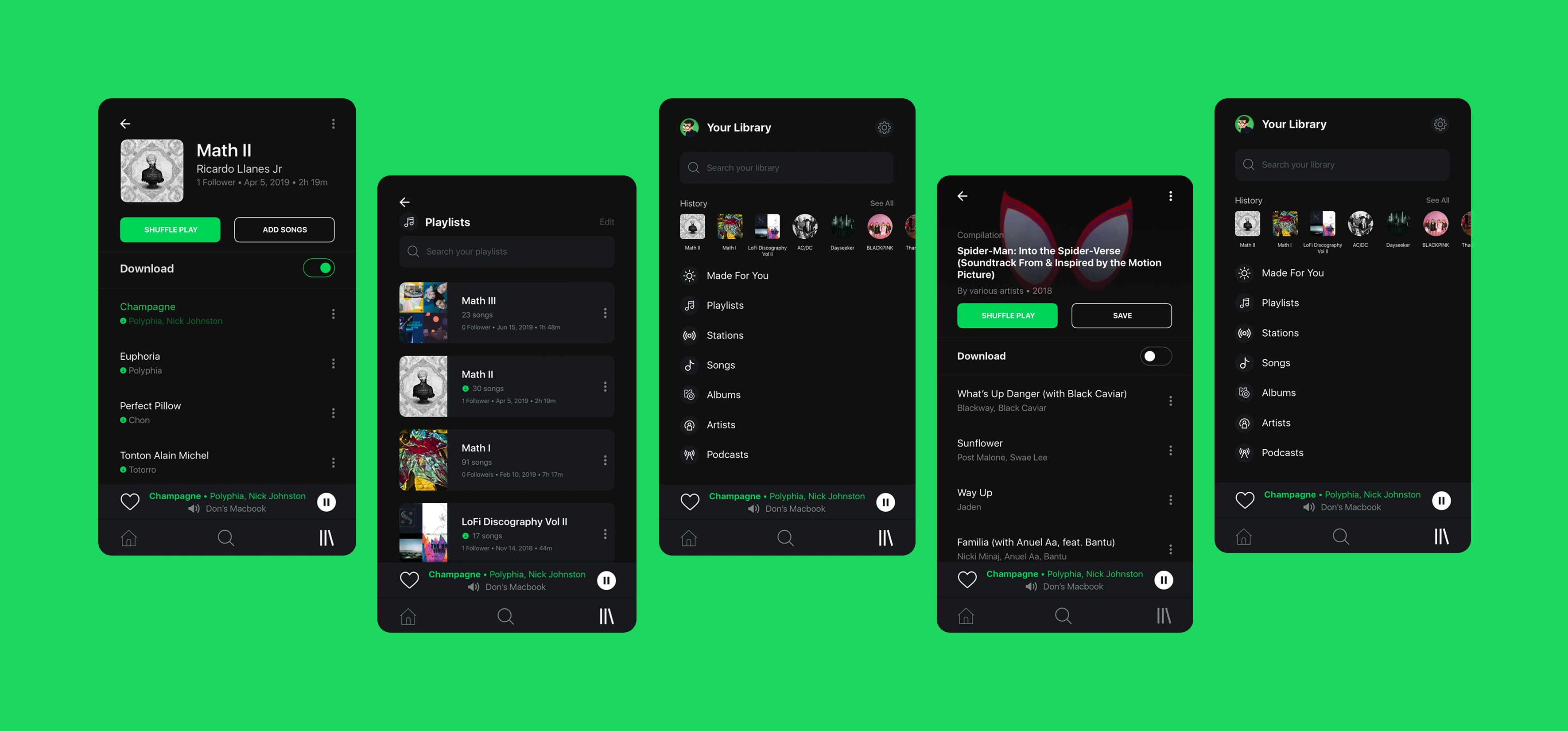
This project explored a soft redesign of Spotify’s mobile experience, focusing on simplifying navigation and refining the overall visual consistency. The goal was to create a cleaner, more approachable interface while maintaining Spotify’s recognizable brand identity.


Web Design
Spotify Case Study: UI Soft Redesign
This project explored a soft redesign of Spotify’s mobile experience, focusing on simplifying navigation and refining the overall visual consistency. The goal was to create a cleaner, more approachable interface while maintaining Spotify’s recognizable brand identity.
Web Design
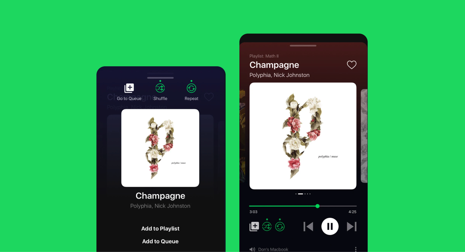
Spotify Case Study: UI Soft Redesign
This project explored a soft redesign of Spotify’s mobile experience, focusing on simplifying navigation and refining the overall visual consistency. The goal was to create a cleaner, more approachable interface while maintaining Spotify’s recognizable brand identity.