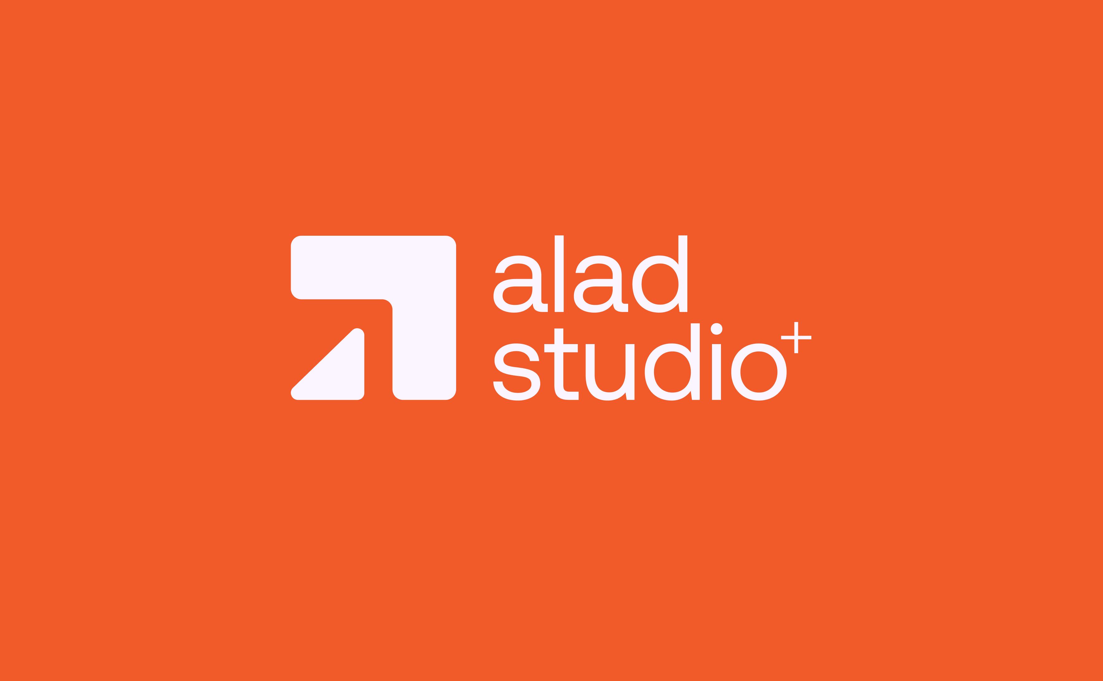
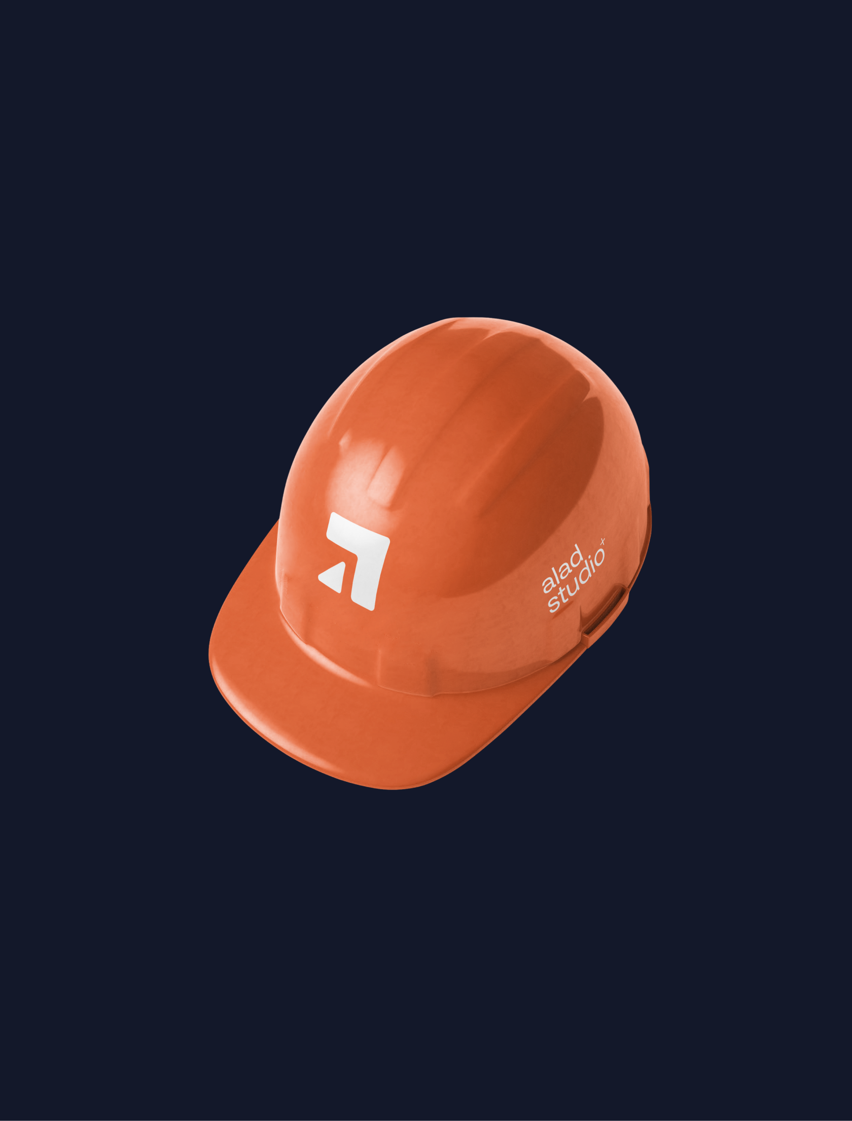


The logo was designed to embody upward movement and growth — an angular form that feels architectural in its geometry but modern in execution.
It’s simple, scalable, and instantly recognizable whether it’s placed on signage, digital screens, or construction gear.
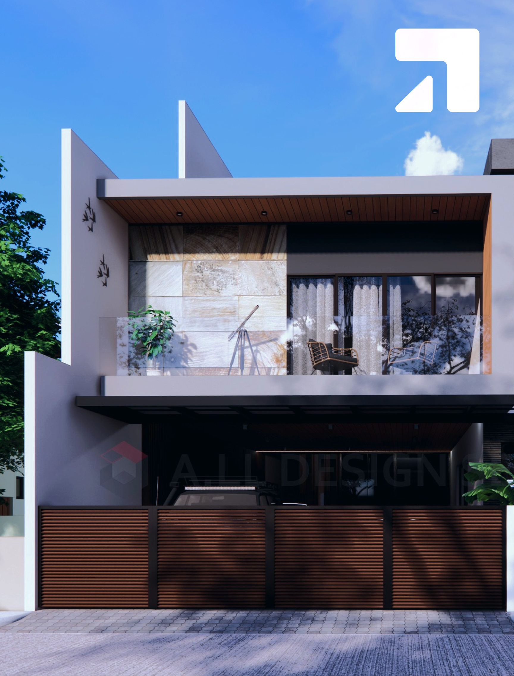
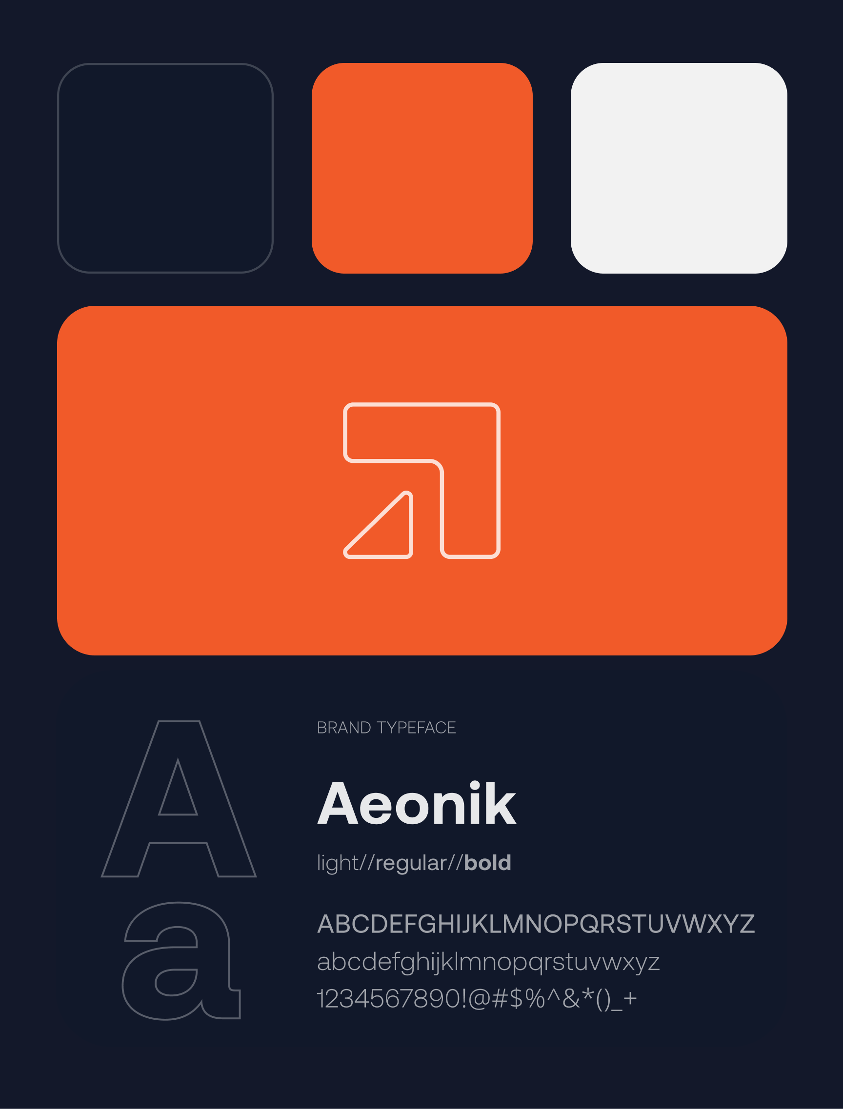
The final system gives Alad Studio+ a bold and cohesive identity that mirrors their work: modern, reliable, and impactful. Just like their buildings, the brand identity is built to last.
